Chapter 2 Trade Performance
2.1 Data Download
Before we start, let’s load the necessary R packages and turn off scientific notation.
library(tidyverse) # for manipulating data
library(readxl) # for reading in data files in a clean format
options(scipen = 100) # turn off scientific notation
For this chapter, we’ll primarily use the same data file obtained from the UN Comtrade database in the previous chapter. However, in addition to the data file that spans years 2016-2020, we also want to download the same dataset for the 2011-2015 period, so that we can analyze trends over a longer period for some of the indicators.
The 2011-2015 dataset can either be downloaded directly here, or it can be downloaded by going to the UN Comtrade website and following the same steps as in the Ch. 1 Data Download but with years 2011-2015 selected instead.
Once the 2011-2015 data is downloaded, we will clean it the same way as before and combine it with the 2016-2020 data to create a 10-year data set stored in data object.
# import 2016-2020 data
# make sure that you indicate the correct path to the directory containing downloaded dataset
data <- read_csv(paste0(data_path, "TradeData_all-world-16-20.csv"))

# select and rename columns
data <- data %>%
  select(RefYear, ReporterDesc, FlowDesc, PartnerDesc, PrimaryValue) %>%
  rename(year = RefYear, reporter = ReporterDesc, trade_direction = FlowDesc,
         partner = PartnerDesc, trade_value_usd = PrimaryValue)

# import 2011-2015 data
data_prev <- read_csv(paste0(data_path, "TradeData_all-world-11-15.csv"))

# select and rename columns
data_prev <- data_prev %>%
  select(RefYear, ReporterDesc, FlowDesc, PartnerDesc, PrimaryValue) %>%
  rename(year = RefYear, reporter = ReporterDesc, trade_direction = FlowDesc,
         partner = PartnerDesc, trade_value_usd = PrimaryValue)

# combine two datasets
data <- rbind(data_prev, data)
rm(data_prev)

# view the dataset
data
## # A tibble: 3,351 × 5
## year reporter trade_direction partner trade_value_usd
## <dbl> <chr> <chr> <chr> <dbl>
## 1 2011 Afghanistan Import World 6390310947
## 2 2011 Afghanistan Export World 375850935
## 3 2011 Albania Import World 5395853069
## 4 2011 Albania Export World 1948207305
## 5 2011 Algeria Import World 47219730324
## 6 2011 Algeria Export World 73436306091
## 7 2011 Andorra Import World 1617690977
## 8 2011 Andorra Export World 114022713
## 9 2011 Angola Import World 20790996039
## 10 2011 Angola Export World 66427390220
## # … with 3,341 more rows2.2 Growth Rate of Exports
What does it tell us? The growth rate is one of the most common indicators used when assessing the progress of an economy in any area of economic activity. Often the rate is calculated at level of product groups to identify ‘dynamic sectors.’ Comparison of such indicators over many countries might be of interest to producer or exporter associations, investors, policymakers and trade negotiators.
Definition: The annual growth rate is the percentage change in the value of exports between two adjacent time periods. The compound growth rate is the annual growth rate required to generate a given total growth over a given time period. If the time period is a single year (n is equal to 1), this is the same as the annual growth rate.
The growth rate may also be calculated for a subset of destinations, or for a subset of products, with appropriate modification. The growth rate can also be calculated for imports and/or trade (imports plus exports).
Mathematical definition:
where s is the set of countries in the source, w is the set of countries in the world, and X0 is the bilateral total export flow in the start period, X1 is the bilateral total export flow in the end period, and n is the number of periods (not including the start).
Range of values: The growth rate is a percentage. It can take a value between -100 per cent (if trade ceases) and +∞. A value of zero indicates that the value of trade has remained constant.
Limitations: Does not explain the source of growth. When evaluating long periods need to be careful of changes in measurement and methods. Growth rates assessed on nominal trade figures may be distorted by exchange rate movements and other factors in the short run.
As a first example, we are going to find the annual export growth rate and compound export growth rate for China over the period of 2011-2020.
We will use arrange(desc(year)) to invert the order of observations by year (we want a descending order).
GRX <- data %>%
  # keep data on exports from China and India, select columns of interest
  filter(reporter %in% c("China") & trade_direction == "Export") %>%
  select(reporter, year, trade_value_usd)

GRX <- GRX %>%
  # arrange the data set by year in descending order
   arrange(desc(year))

GRX
## # A tibble: 10 × 3
## reporter year trade_value_usd
## <chr> <dbl> <dbl>
## 1 China 2020 2589098353298
## 2 China 2019 2499206993866
## 3 China 2018 2486439719803
## 4 China 2017 2263370504301
## 5 China 2016 2097637171895
## 6 China 2015 2273468224113
## 7 China 2014 2342292696320
## 8 China 2013 2209007280259
## 9 China 2012 2048782233084
## 10 China 2011 1898388434783When calculating annual export growth for China, we will use lead() function to divide each of China’s annual export flow values by the export flow values of the corresponding preceding years. Note, we are using lead() here and not lag(), because the data is sorted by year in descending order. Calculated value related to the first year of the examined period (2011) will hence have NA, as the dataset does not contain export values from the preceding year (2010).
To calculate compound annual export growth rate for China we will need to take more steps. And since the process is a bit more complicated, we will first calculate compound growth rates for years 2020 (9 periods of growth from 2011) and 2016 (5 periods of growth from 2011). Then we make calculations for all years that are present in our dataset.
# calculate annual growth rates for China
GRX$Annual_growth <- (GRX$trade_value_usd / lead(GRX$trade_value_usd)-1)*100
GRX$Annual_growth <- round(GRX$Annual_growth, 4)

# calculate compound annual growth rates for China for 2020 for reference
# note that n of 9 is used since there are 9 periods of growth from 2011 till 2020
((GRX$trade_value_usd[1]/GRX$trade_value_usd[10])^(1/9)-1)*100
## [1] 3.507953# calculate compound annual growth rates for CHina for 2016 for reference
# note that n of 5 is used since there are 5 periods of growth from 2011 till 2016
((GRX$trade_value_usd[5]/GRX$trade_value_usd[10])^(1/5)-1)*100## [1] 2.01618# calculate compound annual growth rates over the full period of 2011-2020
# create two new columns with NAs
GRX$Compound_Growth <- NA
GRX$n <- NA
# populate column n with the corresponding values of 1/n
GRX$n[1:9] <- 1/c(9:1)
# calculate the compound growth values
GRX$Compound_Growth[-10] <- ((GRX$trade_value_usd[1:9] / GRX$trade_value_usd[10]) ^ GRX$n[1:9] - 1) * 100
GRX$Compound_Growth[-10] <- round(GRX$Compound_Growth[-10],4)
# view the dataframe
GRX[, c(2,4,5)]## # A tibble: 10 × 3
## year Annual_growth Compound_Growth
## <dbl> <dbl> <dbl>
## 1 2020 3.60 3.51
## 2 2019 0.514 3.50
## 3 2018 9.86 3.93
## 4 2017 7.90 2.97
## 5 2016 -7.73 2.02
## 6 2015 -2.94 4.61
## 7 2014 6.03 7.26
## 8 2013 7.82 7.87
## 9 2012 7.92 7.92
## 10 2011 NA NAIn our second example we will calculate compound growth rates for China, India, ASEAN and rest of the world (ROW) over a period of 10 years (2011-2020). Let’s start by getting data for ASEAN, China and India.
# create a vector with names of ASEAN economies
ASEAN <- c("Viet Nam", "Thailand", "Singapore", "Philippines",
           "Myanmar", "Malaysia", "Lao People's Dem. Rep.",
           "Indonesia", "Cambodia", "Brunei Darussalam")

# create a vector with all economy names
group <- c(ASEAN, "China", "India") # add China and India for comparison

# get necessary data for the selected economies
x <- data %>%
  filter(reporter %in% group & trade_direction == "Export") %>%
  select(reporter, year, trade_value_usd)

unique(x$reporter)
## [1] "Brunei Darussalam" "Myanmar" "Cambodia"
## [4] "China" "Indonesia" "Lao People's Dem. Rep."
## [7] "Malaysia" "Philippines" "India"
## [10] "Singapore" "Viet Nam" "Thailand"x## # A tibble: 120 × 3
## reporter year trade_value_usd
## <chr> <dbl> <dbl>
## 1 Brunei Darussalam 2011 1.25e10
## 2 Myanmar 2011 8.13e 9
## 3 Cambodia 2011 6.70e 9
## 4 China 2011 1.90e12
## 5 Indonesia 2011 2.03e11
## 6 Lao People's Dem. Rep. 2011 1.90e 9
## 7 Malaysia 2011 2.27e11
## 8 Philippines 2011 4.80e10
## 9 India 2011 3.01e11
## 10 Singapore 2011 4.16e11
## # … with 110 more rowsIn the next few steps we reshape the data and calculate total export flows from ASEAN region in each year.
# reshape the dataset to have export flows for each economy in a separate column
x <- x %>% spread(reporter, trade_value_usd) %>%
  # arrange the data by year in descending order
  arrange(desc(year))

# calculate total export flows for ASEAN region in each year
x$ASEAN <- rowSums(x[,which(names(x) %in% ASEAN)], na.rm = T)

# remove redundant columns
x <- x %>% select(year, China, India, ASEAN)

x
## # A tibble: 10 × 4
## year China India ASEAN
## <dbl> <dbl> <dbl> <dbl>
## 1 2020 2589098353298 275488744928. 1.40e12
## 2 2019 2499206993866 323250726425. 1.41e12
## 3 2018 2486439719803 322492099897. 1.45e12
## 4 2017 2263370504301 294364490163. 1.32e12
## 5 2016 2097637171895 260326912335 1.15e12
## 6 2015 2273468224113 264381003631 1.17e12
## 7 2014 2342292696320 317544642257 1.30e12
## 8 2013 2209007280259 336611388774 1.28e12
## 9 2012 2048782233084 289564769447 1.26e12
## 10 2011 1898388434783 301483250168 1.25e12Then, we calculate total export flows in each year for the rest of the world group (ROW).
Note that summarise() function creates a new data frame. It will have one (or more) rows for each combination of grouping variables; if there are no grouping variables, the output will have a single row summarizing all observations in the input. It will contain one column for each grouping variable and one column for each of the summary statistics that you have specified.
ROW <- data %>%
  # only keep data on export flows from the ROW economies
  filter(!reporter %in% group & trade_direction == "Export") %>%
  # group by year
  group_by(year) %>%
  # calculate total export flows for each year
  summarize(ROW = sum(trade_value_usd, na.rm = T))

# merge ROW data with the rest of the dataset
x <- x %>% left_join(ROW, by = "year")

x
## # A tibble: 10 × 5
## year China India ASEAN ROW
## <dbl> <dbl> <dbl> <dbl> <dbl>
## 1 2020 2589098353298 275488744928. 1.40e12 1.29e13
## 2 2019 2499206993866 323250726425. 1.41e12 1.41e13
## 3 2018 2486439719803 322492099897. 1.45e12 1.47e13
## 4 2017 2263370504301 294364490163. 1.32e12 1.34e13
## 5 2016 2097637171895 260326912335 1.15e12 1.22e13
## 6 2015 2273468224113 264381003631 1.17e12 1.23e13
## 7 2014 2342292696320 317544642257 1.30e12 1.45e13
## 8 2013 2209007280259 336611388774 1.28e12 1.47e13
## 9 2012 2048782233084 289564769447 1.26e12 1.42e13
## 10 2011 1898388434783 301483250168 1.25e12 1.46e13Now let’s once again use lead() function when calculating annual growth rate (AG) for each economy.
# make the calculations for each economy
x$AG_China <- (x$China / lead(x$China)-1)*100
x$AG_India <- (x$India / lead(x$India)-1)*100
x$AG_ASEAN <- (x$ASEAN / lead(x$ASEAN)-1)*100
x$AG_ROW <- (x$ROW / lead(x$ROW)-1)*100

# keep only the data on annual growth rates
x <- x[-10, c(1,6:9)]

x
## # A tibble: 9 × 5
## year AG_China AG_India AG_ASEAN AG_ROW
## <dbl> <dbl> <dbl> <dbl> <dbl>
## 1 2020 3.60 -14.8 -1.27 -8.98
## 2 2019 0.513 0.235 -2.28 -3.91
## 3 2018 9.86 9.56 9.90 9.72
## 4 2017 7.90 13.1 14.4 10.1
## 5 2016 -7.73 -1.53 -1.94 -0.902
## 6 2015 -2.94 -16.7 -9.55 -15.3
## 7 2014 6.03 -5.66 1.25 -1.50
## 8 2013 7.82 16.2 1.75 3.43
## 9 2012 7.92 -3.95 0.710 -2.47Now let’s create a line plot fo see the trend over time. We again will reshape the data to long format for easier plotting.
# pivot the dataset
x <- x %>%
  pivot_longer(cols = AG_China:AG_ROW, names_to = "country",
               names_prefix = "AG_", values_to = "ag")

# create a time-series chart by selecting your variables,
# and by specifying the color coding rule
GRX_plot <- ggplot(x, aes(x = year, y = ag, color = country)) +
# adding the line charts
  geom_line() +
# providing the chart title, and deactivating axis labels,
# and creating a color coding legend
  labs(title = "Selected Export Growth Rates (2011-2020)", x = NULL, y = NULL,
       color = "Country Group") +
  # specifying the color palette
  scale_color_brewer(palette = "Set1") +
# applying the minimal theme
  theme_minimal()

GRX_plot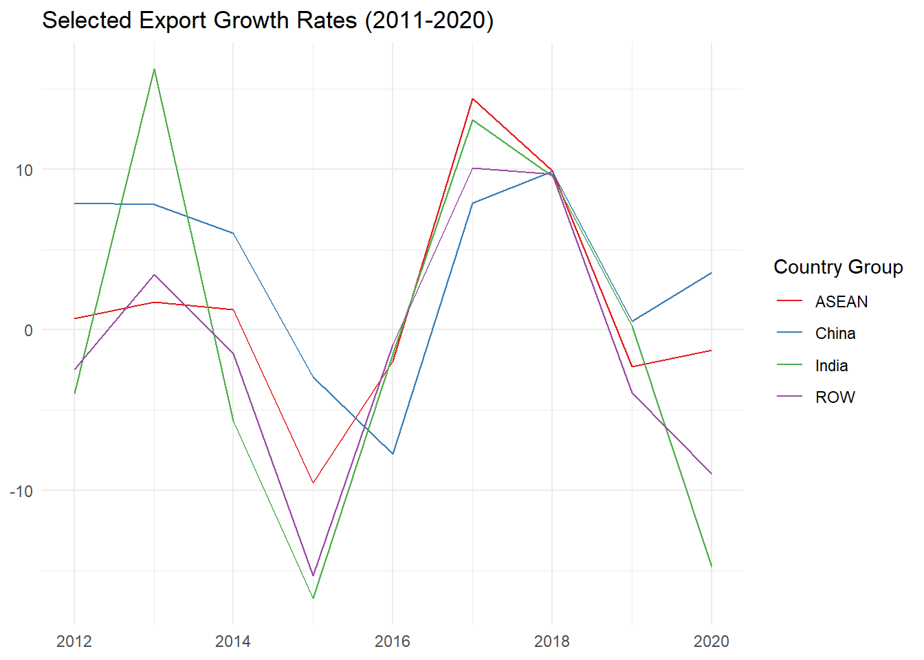
2.3 Normalized Trade Balance
What does it tell us? The normalized trade balance represents a record of a country’s trade transactions with the rest of the world normalized on its own total trade. In general, economists expect that the trade balance will be zero in the long run, thus imports are financed by exports, but it may vary considerably over shorter periods.
Definition: The trade balance (total exports less total imports) as fraction of total trade (exports plus imports).
Mathematical definition:
where s is the set of countries in the source, w is the set of countries in the world, X is the bilateral total export flow, and M is the bilateral total import flow in the end period. In words, we take total exports from the source region less total imports to the source region, and divide by the total trade of the source region.
Range of values: The index range is between -1 and +1, which allows unbiased comparisons across time, countries and sectors. A value of zero indicates trade balance.
Limitations: The economic reasons for a trade surplus/deficit are complex, and the index cannot directly help shed light on them. Potential for misuse high, especially with respect to bilateral balances.
We are going to calculate Normalized Trade Balance (NTB) for a set of countries in 2020.
# create a vector with names of selected economies
group <- c("Bangladesh", "China", "India", "Indonesia", "Malaysia",
           "New Zealand", "Philippines", "Rep. of Korea", "Singapore",
           "Sri Lanka", "Thailand", "Viet Nam")

# filter to only keep data on export and import flows of the selected economies in 2020
NTB <- data %>%
  filter(reporter %in% group & year == 2020) %>%
  select(reporter, trade_direction, trade_value_usd)

# reshape the dataset to keep export and import data in separate columns
NTB <- NTB %>% spread(trade_direction, trade_value_usd)

# calculate NTB value, and round it
NTB$Normalized_Trade_Balance <- (NTB$Export - NTB$Import) / (NTB$Export + NTB$Import)
NTB$Normalized_Trade_Balance <- round(NTB$Normalized_Trade_Balance, 2)

NTB
## # A tibble: 11 × 4
## reporter Export Import Normalized_Trade_Balance
## <chr> <dbl> <dbl> <dbl>
## 1 China 2.59e12 2.07e12 0.11
## 2 India 2.75e11 3.68e11 -0.14
## 3 Indonesia 1.63e11 1.42e11 0.07
## 4 Malaysia 2.34e11 1.90e11 0.1
## 5 New Zealand 3.89e10 3.71e10 0.02
## 6 Philippines 6.52e10 9.51e10 -0.19
## 7 Rep. of Korea 5.13e11 4.67e11 0.05
## 8 Singapore 3.74e11 3.29e11 0.06
## 9 Sri Lanka 1.07e10 1.56e10 -0.19
## 10 Thailand 2.31e11 2.08e11 0.05
## 11 Viet Nam 2.81e11 2.61e11 0.04Now let’s create a bar chart plot to examine the results.
# create a bar chart by
NTB_plot <- NTB %>%
  # selecting your variables, and reordering reporters alphabetically
  ggplot(aes(x = Normalized_Trade_Balance, y = reorder(reporter, desc(reporter)))) +
  # adding a bar chart to the chart area, specifying the bar width and removing the legend
  geom_bar(aes(fill = Normalized_Trade_Balance), stat = 'identity', width = 0.6, show.legend = F) +
  # adding the chart title and removing axis labels
  labs(title = "Normalized Trade Balance for Selected Economies (2020)", x = NULL, y = NULL) +
   # adding a vertical line indicating location of 0 on x axis
  geom_vline(xintercept = 0) +
  # applying the minimal theme
  theme_minimal()

NTB_plot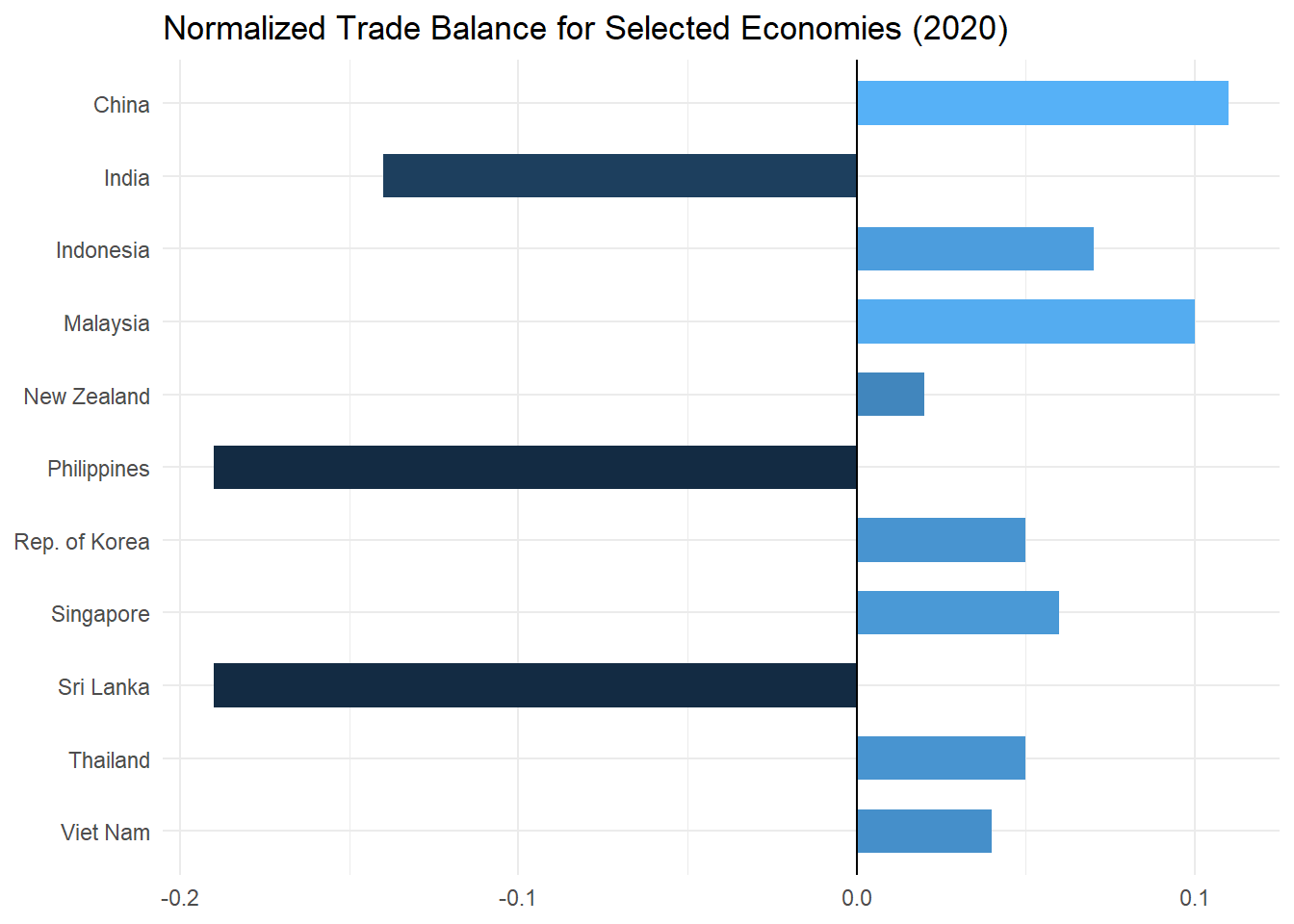
In the chart above negative figures indicate a trade deficit, observed in India, the Philippines, and Sri Lanka. Substantial trade surpluses are observed in China and Malaysia. However, the balance depicted is calculated on merchandise trade only, the balance including services trade may differ.
2.4 Export/Import Coverage
What does it tell us? This is an alternative to the normalized trade balance. It tells us whether or not a country’s imports are fully paid for by exports in a given year. In general, economists expect that the trade balance will be zero in the long run, thus imports are financed by exports, but it may vary considerably over shorter periods.
Definition: The ratio of total exports to total imports.
Mathematical definition:
where s is the set of countries in the source, w is the set of countries in the world, X is the bilateral total export flow, and M is the bilateral total import flow in the end period. In words, we take total exports from the source region, and divide by the total imports of the source region.
Range of values: The values for this index range from 0 when there are no exports to +∞ when there are no imports. A ratio of 1 signals full coverage of imports with exports (trade balance).
Limitations: Same as for the normalized trade balance. The economic reasons for a trade surplus/deficit are complex, and the index cannot directly help shed light on them. Potential for misuse high, especially with respect to bilateral balances.
To calculate the Export/Import Coverage (XMC) we just need to divide total exports by total import for each economy. To do that we can re-use the previous data frame, making sure to remove NTB variable as we don’t need it anymore.
# get the dataset from previous section
XMC <- NTB[,-4]

# calculate export/import coverage for selected economies in 2020
XMC$XM_Coverage <- XMC$Export / XMC$Import
XMC$XM_Coverage <- round(XMC$XM_Coverage, 2)

XMC
## # A tibble: 11 × 4
## reporter Export Import XM_Coverage
## <chr> <dbl> <dbl> <dbl>
## 1 China 2.59e12 2.07e12 1.25
## 2 India 2.75e11 3.68e11 0.75
## 3 Indonesia 1.63e11 1.42e11 1.15
## 4 Malaysia 2.34e11 1.90e11 1.23
## 5 New Zealand 3.89e10 3.71e10 1.05
## 6 Philippines 6.52e10 9.51e10 0.69
## 7 Rep. of Korea 5.13e11 4.67e11 1.1
## 8 Singapore 3.74e11 3.29e11 1.14
## 9 Sri Lanka 1.07e10 1.56e10 0.69
## 10 Thailand 2.31e11 2.08e11 1.11
## 11 Viet Nam 2.81e11 2.61e11 1.08Let’s display results in a bar chart.
# create a bar chart by selecting your variables, and reordering reporters alphabetically
XMC_plot <- ggplot(XMC, aes(x = XM_Coverage, y = reorder(reporter, desc(reporter)))) +
  # adding a bar chart to the chart area, specifying the bar width and removing the legend
  geom_bar(fill = 'dodgerblue4', stat='identity', width = 0.6, show.legend = FALSE) +
  # adding the chart title and removing axis labels
  labs(title = "Export/Import Coverage for Selected Economies (2020)", x = NULL, y = NULL) +
  # adding a vertical line indicating location of 1 on x axis
  geom_vline(xintercept = 1, color = 'red', linewidth = 1) +
  # applying the minimal theme
  theme_minimal()

XMC_plot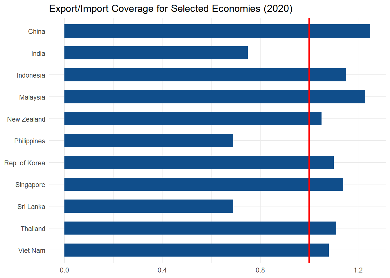
We used the same subset of countries and year as we did for the normalized trade balance indicator in the section above, for comparative purposes. The above figure depicts the export/import coverage for selected economies in 2020.
Now figures less than one indicate a deficit, observed in India, the Philippines, and Sri Lanka. Substantial surpluses are observed in China and Malaysia. Again, the balance depicted is calculated on merchandise trade only. The balance including services trade may differ.