Chapter 5 Protection
5.1 Data Download
Run the script below to install our usual R packages and to turn off scientific notation.
library(tidyverse) # for manipulating data easily
library(readxl) # for reading in data files in a clean format
options(scipen = 100) # turn off scientific notation
For this section we will use a tariff dataset downloaded from World Bank’s World Integrated Trade Solutions (WB WITS) database. You can access and download the required dataset here, save it to your computer, and then load it for this session with the code below.
# read the dataset into R session,
# make sure to indicate the correct path to the directiry containing the downloaded dataset
tf <- read_csv(paste0(data_path, "Data-Protection7.csv"))

# keep selected columns
tf <- tf %>%
  select(`Reporter Name`, Product, `Partner Name`, `Tariff Year`,
         `Trade Year`, DutyType, `Simple Average`, `Weighted Average`,
         `Standard Deviation`, `Imports Value in 1000 USD`)

# rename columns
tf <- tf %>%
  rename(reporter = `Reporter Name`, product = Product, partner = `Partner Name`,
         tf_year = `Tariff Year`, trade_year = `Trade Year`, duty = DutyType,
         simple = `Simple Average`, wgt = `Weighted Average`, sd = `Standard Deviation`,
         value = `Imports Value in 1000 USD`)

# rename economy or economy group names as below
tf$reporter[which(tf$reporter == "Vietnam")] <- "Viet Nam"
tf$reporter[which(tf$reporter == "ASEAN 6 Countries --- ASEAN")] <- "ASEAN"
tf$partner[which(tf$partner == "ASEAN 6 Countries --- ASEAN")] <- "ASEAN"

tf
## # A tibble: 213,025 × 10
## reporter product partner tf_year trade_year duty simple wgt sd value
## <chr> <chr> <chr> <dbl> <dbl> <chr> <dbl> <dbl> <dbl> <dbl>
## 1 Indonesia 010121 World 2021 2021 BND 40 NA 0 NA
## 2 Indonesia 010121 World 2021 2021 MFN 0 NA 0 NA
## 3 Indonesia 010129 World 2021 2021 AHS 3.33 4.56 2.36 1065.
## 4 Indonesia 010129 World 2021 2021 BND 40 40 0 1065.
## 5 Indonesia 010129 World 2021 2021 MFN 5 5 0 1065.
## 6 Indonesia 010130 World 2021 2021 AHS 2.5 2.5 2.5 23.6
## 7 Indonesia 010130 World 2021 2021 BND 40 40 0 23.6
## 8 Indonesia 010130 World 2021 2021 MFN 2.5 2.5 2.5 23.6
## 9 Indonesia 010190 World 2021 2021 BND 40 NA 0 NA
## 10 Indonesia 010190 World 2021 2021 MFN 5 NA 0 NA
## # … with 213,015 more rowsSo, as you can see the dataset includes data on tariffs applied by a set of selected selected economies on imports from ASEAN and World on traded goods disaggregated at 6-digit level of the HS. For more details on the datasets characteristics please refer to the WB WITS database.
As you can see the dataset already contains data on simple average and weighted average tariffs per each 6-digit HS commodity. For instructional purposes in the sections below we will go through the steps of calculating these indicators for broader product groups, as well as some other indicators using this dataset.
Please note, that as with the previous sections, only some basic data cleaning is done for some of the datasets used with this Guide. The calculations results may vary depending on what data manipulation is implemented to fill in the missing data points or to ensure that datasets for different economies and time periods are comparable.
5.2 Average Tariff
What does it tell us? The (simple) average tariff tells us how much protection is applied by an economy or region, on average. Higher values indicate a more protected economy, lower values a less protected economy. In general, lower protection levels indicate a greater degree of integration with the global economy. Can be calculated for a subset of regions or products.
Definition: The mean (average) value of tariffs in a country or region’s full tariff schedule, or a part of the schedule.
Mathematical definition:
where d is the importing country, s is the set of source countries, i is the set of products of interest, t is the tariff of interest (e.g., bound or applied) defined as a percentage, n is the number of products in the product set, and p is the number of countries in the source. In words, we take the sum of all the tariffs in the lines of interest, and divide it by the number of elements in those lines.
The elements of the summation and division must be adjusted accordingly if the group of interest is not the full bilateral tariff schedule. If, for example, we are interested only in the average MFN tariff, then we sum the MFN tariffs only over product categories for a given economy, and divide by the number of product categories.
Range of values: The tariff is defined as a percentage, so the average can range from 0 to +∞ (import ban).
Limitations: The simple average tariff does not adjust for the significance of different products in the trade profile, so a high tariff on an insignificant product may overstate the degree of protection. Does not provide information on tariff peaks.
As the first step we will calculate simple averages (SA) of the effectively applied tariffs by Indonesia. We’ll calculate a simple average of tariff rates for each partner of interest in the data set (ASEAN-6 and World). For that we will usegroup_by() to group data both by partner. And then we will use mean() function to calculate a simple average for each group and round the result to two decimal points.
To read more about the different types of tariffs, you can visit this WITS page.
# get the data on effectively applied tariff rates applied by Indonesia to imports from ASEAN and World
SA <- tf %>% filter(reporter == "Indonesia" & partner %in% c("ASEAN", "World") & duty == "AHS")

SA <- SA %>%
  # group data by partner and duty type
  group_by(partner) %>%
  # calculate simple average
  summarize(SA = round(mean(simple, na.rm = T), 2)) %>%
  # ungroup data
  ungroup()

SA
## # A tibble: 2 × 2
## partner SA
## <chr> <dbl>
## 1 ASEAN 0.39
## 2 World 4.88From our calculation results we can see, that in Indonesia’s case the average effectively applied tariff on imports from ASEAN-6 region is notably lower than the average effectively applied tariff on imports from the world.
Next, we will calculate average effectively applied tariff rates and average bound tariff rates for all ASEAN-6 economies so that we can compare them.
After we are done with the calculation, we will use the facet_wrap() function of ggplot to create two graphs for each type of duty and display them side-by-side and on the same scale.
# create vector with economy names
ASEAN.6 <-  c("Indonesia", "Malaysia", "Philippines", "Singapore", "Thailand", "Viet Nam")

# get the necessary data
sa_plot <- tf %>%
  filter(reporter %in% ASEAN.6 & partner %in% c("ASEAN", "World") & duty %in% c("AHS", "BND"))

sa_plot <- sa_plot %>%
  # group data by reporter, duty type and partner
  group_by(reporter, duty, partner) %>%
  # calculate the average tariff rates
  summarize(SA = round(mean(simple, na.rm = T), 2)) %>%
  # ungroup
  ungroup()
## `summarise()` has grouped output by 'reporter', 'duty'. You can override using
## the `.groups` argument.sa_plot## # A tibble: 24 × 4
## reporter duty partner SA
## <chr> <chr> <chr> <dbl>
## 1 Indonesia AHS ASEAN 0.39
## 2 Indonesia AHS World 4.88
## 3 Indonesia BND ASEAN 37.0
## 4 Indonesia BND World 37.4
## 5 Malaysia AHS ASEAN 5.29
## 6 Malaysia AHS World 4.99
## 7 Malaysia BND ASEAN 15.0
## 8 Malaysia BND World 14.5
## 9 Philippines AHS ASEAN 0.02
## 10 Philippines AHS World 3.46
## # … with 14 more rows# create a plot by
SA_plot <- sa_plot %>%
# turning partner variable to factors
mutate(partner = factor(partner, levels = c("World", "ASEAN"))) %>%
# assigning variables to axes, and ordering them as needed
ggplot(aes(x = reorder(reporter, desc(reporter)), y = SA, group = reorder(partner, desc(partner)))) +
# setting up for the bars for the individual partners to be displayed side by side
geom_col(aes(fill = partner), position = "dodge") +
# flipping the coordinates
coord_flip() +
# adding the chart title and removing axis labels
labs(title = "Effective Applied and Bound Tariff Rates (%) by ASEAN-6 economies (2021)", x = NULL, y = NULL, fill = NULL) +
# selecting the color palette
scale_fill_brewer(palette = "Set1") +
# separating values for AHS and BND to be displayed in two adjacent charts
facet_wrap(~duty) +
# applying the minimal theme
theme_minimal() +
# setting the bottom position for the legend
theme(legend.position = "bottom")
SA_plot 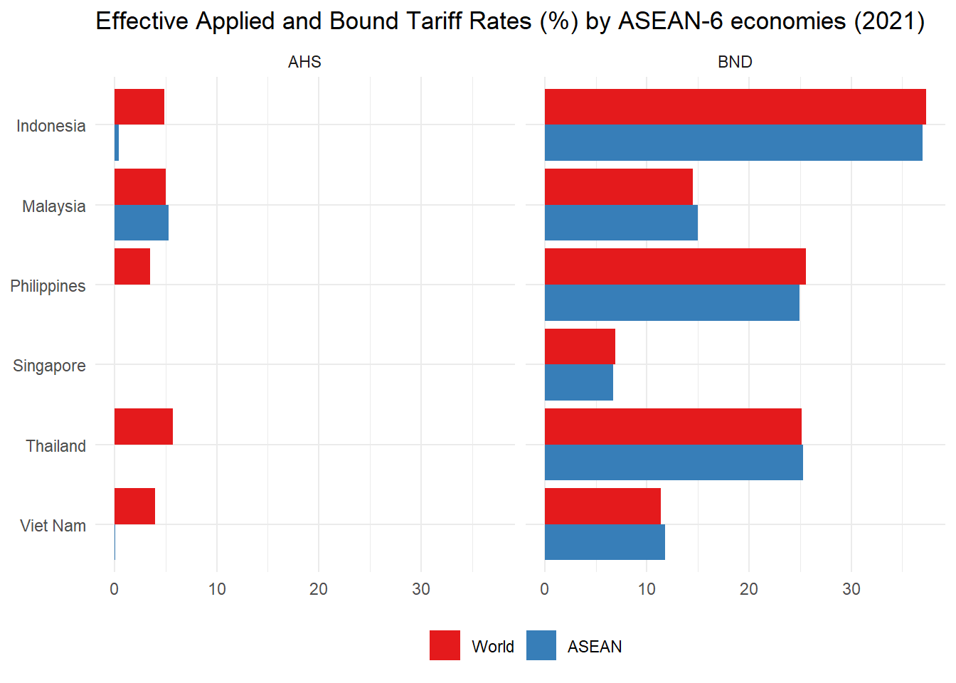
So we have calculated average AHS and BND tariffs for 6 individual economies across all trading partners, and average AHS and BND tariffs across ASEAN-6 members. Note how Singapore has a zero average applied tariff for ASEAN members and the world, but still maintains a positive bound tariff. The difference between the effectively applied tariffs in trade with the world and with ASEAN reflect tariff preferences under ASEAN Free Trade Agreement (AFTA).
5.3 Weighted Average Tariff
What does it tell us? Like the (simple) average, the weighted average tariff tells us how much protection is applied by an economy or region, on average. Higher values indicate a more protected economy, lower values a less protected economy. The difference is that the weighted average tariff takes into account the volume of imports in each product category.
Definition: The sum of the tariffs in a country or region’s tariff schedule (or part of the schedule) multiplied by a weighting factor representing the product’s importance in the country or region’s trade.
Mathematical definition:
where d is the importing country, s (k) is the set of source countries, i is the set of products of interest, t is the tariff of interest (e.g., bound or applied) defined as a percentage, m is the product level imports, and M is total imports by category. In words, we take each bilateral tariff and multiply it by the share of the corresponding bilateral import flow in total imports. We then sum the weighted tariffs across all sources/product categories.
As with the simple average, the elements of the summation and division must be adjusted accordingly if the group of interest is not the full bilateral tariff schedule.
Range of values: The tariff is defined as a percentage, so the weighted average can range from 0 to +∞ (import ban).
Limitations: As with the simple average, this index may mask tariff peaks. It has a tendency to understate the level of protection because very heavily protected products are imported less (because of the high tariff), and therefore receive a small weight.
We will now calculate the weighted averages of the effectively applied tariffs (AHS) for each ASEAN-6 economy in their trade with the World in 2020. To do that in addition to our tariff dataset from WB WITS database we will also use the trade flow dataset from UN Comtrade.
We have already pre-downloaded and pre-cleaned the data on 2020 import flows of goods (disaggredated to 6-digit of the HS) to each ASEAN-6 economy from the world (mostly to remove NAs by assuming zero flows for all cases of missing commodity import data). You can access this dataset here.
# import the dataset on 2020 import flows from WORLD to ASEAN-6 economies disaggregated by commodity type
ASEAN.6_imports <- read.csv(paste0(data_path, "/TradeData_all-world-comm-20-AG6.csv"))

# do some cleaning
ASEAN.6_imports <- ASEAN.6_imports %>% select(-X)

ASEAN.6_imports$commodity_code <- as.numeric(ASEAN.6_imports$commodity_code)

head(ASEAN.6_imports, 10)
## commodity_code reporter trade_value_usd
## 1 10121 Indonesia 0
## 2 10129 Indonesia 493080
## 3 10130 Indonesia 0
## 4 10190 Indonesia 0
## 5 10221 Indonesia 2609334
## 6 10229 Indonesia 428106902
## 7 10231 Indonesia 0
## 8 10239 Indonesia 4100171
## 9 10290 Indonesia 0
## 10 10310 Indonesia 0# get the data on AHS tariffs per commodity type (also 6-digit of the HS)
WA <- tf
# clean the data
WA <- WA %>%
filter(reporter %in% ASEAN.6 & partner == "World" & duty == "AHS") %>%
select(-value, -tf_year, -wgt, -sd, -duty, -trade_year, -partner) %>%
unique()
WA$product <- as.numeric(WA$product)
# join the two datasets, while making sure to preserve all data on import flows for all commodities
# including those for which tariff data is missing in the dataset
# we do that by indicating to use ASEAN.6_import dataset for argument x of left_join function
WA <- left_join(ASEAN.6_imports, WA, by = c("commodity_code"="product", "reporter"="reporter"))
# here for the purposes of this Guide we assume that missing tariff data for certain commodities
# means application of zero tariff
WA$simple[is.na(WA$simple)] <- 0
# now we do not have any missing data
anyNA(WA$trade_value_usd)## [1] FALSEanyNA(WA$simple)## [1] FALSEWA_table <- WA %>%
# group data by reporter
group_by(reporter) %>%
# calculate total imports of each ASEAN-6 economy in 2020
mutate(total_trade = sum(trade_value_usd),
# calculate weights to be applied to AHS tariffs
weight = trade_value_usd / total_trade) %>%
# calculate weighted average of the tariff effectively applied by each economy to imports from the world
summarize(WA = round(weighted.mean(simple, weight, na.rm = T), 2),
# recalculate simple average of the tariff effectively applied by each economy to imports from the world,
# given the changes in the dataset structure stemming from data cleaning and filling of NAs
SA = round(mean(simple), 2))
WA_table## # A tibble: 6 × 3
## reporter WA SA
## <chr> <dbl> <dbl>
## 1 Indonesia 3.8 4.57
## 2 Malaysia 3.25 4.65
## 3 Philippines 3.59 3.15
## 4 Singapore 0 0
## 5 Thailand 5.04 5.41
## 6 Viet Nam 2.54 3.61Next we’ll create a graph comparing the simple and the weighted average tariff rates for each ASEAN-6 country to highlight to what extent those may differ. We start by merging WA_table dataset with the filtered sa_plot dataset containing simple averages of AHS applied by ASEAN-6 economies to imports from the world.
# pivot the data for plotting
wa_plot <- WA_table %>%
  pivot_longer(cols = c(WA, SA), names_to = "method", values_to = "value") %>%
  mutate(method = ifelse(method == "WA", "Weighted Average", "Simple Average"))

# create a plot by
WA_plot <- wa_plot %>%
  # turning method variable to factors
  mutate(method = factor(method, levels = c("Weighted Average", "Simple Average"))) %>%
  # assigning values to axes
  # and sorting the variables to be displayed
  ggplot(aes(x = reorder(reporter, desc(reporter)), y = value, group = reorder(method, desc(method)))) +
  # setting up for the bars for the individual methods to be displayed side by side
  geom_col(aes(fill = method), position = "dodge") +
  # flipping the coordinates
  coord_flip() +
  # adding chart title and removing axis labels
  labs(title = "Weighted Versus Simple Average Tariff Rates (%) for ASEAN-6 (2020)", x = NULL, y = NULL, fill = NULL) +
  # choosing the color palette
  scale_fill_brewer(palette = "Set1") +
  # applying the minimal theme
  theme_minimal() +
  # moving legend to the bottom of the chart
  theme(legend.position = "bottom")

WA_plot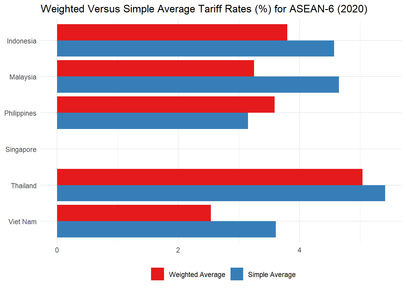
The chart above, compares the simple average applied tariff with the weighted average applied tariff of each examined economy. The weights were calculated using the 2020 trade data from UN Comtrade. We are looking at effective applied tariffs, averaged over the world. Note that the weighted averages can be quite different from the simple averages, in general, smaller.
5.4 Tariff Dispersion
What does it tell us? The tariff dispersion index is a single number that measures how widely spread out are the tariffs in a schedule or part thereof. In other words, a high tariff dispersion index indicates that there is a lot of variation in the tariff schedule. Economists generally believe that a uniform tariff (with low dispersion) is more economically efficient. An alternative measure is to consider the difference between the maximum tariff and the minimum tariff.
Definition: The tariff dispersion index is the standard deviation of the selected tariff line items.
Mathematical definition:
where d is the importing country, s is the set of source countries, i is the set of products of interest, t is the tariff of interest (e.g., bound or applied) defined as a percentage, n is the number of products in the product set, and p is the number of countries in the source.
In words, we calculate the squared sum of the difference between each tariff and tariff mean, divide it by the number of elements in those lines, and then take a square root of that value.
Again, the elements of the summation and division must be adjusted accordingly if the group of interest is not the full bilateral tariff schedule.
Important Note: The mathematical definition for this index provided in the handbook contains an error. Please refer to the mathematical definition provided in this Guide as the correct one.
Range of values: The tariff is defined as a percentage, so dispersion index is measured in the same units. It can range from 0 (if there is a uniform tariff) to +∞.
Limitations: The measure should be used in conjunction with the average tariff. It can be distorted by a small number of exception tariffs.
Now let’s calculate tariff dispersion for Viet Nam. We will look at MFN tariff rates because these rates will be the same for all countries that are members of the WTO. We will filter just on World as a partner to get Viet Nam’s tariff schedule.
# get dataset on Viet Nam's MFN tariffs rates
TD <- tf %>%
  filter(reporter == "Viet Nam" & partner == "World" & duty == "MFN")

# calculate the standard deviation of MFN tariff rates, which
# essentially provides the tariff dispersion value
TD_sd <- round(sd(TD$simple, na.rm = T), 2)
TD_sd
## [1] 11.53Then let’s calculate simple average of MFN tariffs applied by Viet Nam in trade with the world. After that we will create a frequency plot to show where Viet Nam’s tariff rates tend to be set. For the latter step we will first load in the package RColorBrewer to extract the colors used in the previous graphs. And then, we will create a frequency chart and add a solid red line for the MFN tariff mean and a green dashed line for the MFN tariff mean plus the standard deviation.
# calculate simple average of MFN tariff rates
TD_sa <- mean(TD$simple, na.rm = T)
TD_sa
## [1] 9.614054anyNA(TD$simple)## [1] TRUETD <- TD %>% filter(!is.na(simple))
# get the color codes for the graph
#install.packages("RColorBrewer")
library(RColorBrewer)
colors <- brewer.pal(3, "Set1")
# create a plot by
TD_plot <- TD %>%
# assigning values to axes
ggplot(aes(x = simple)) +
# adding the tariff frequency plot, while indicating the line width and color code
geom_freqpoly(color = colors[2], size = 1.2, show.legend = T) +
# adjusting the scale breaks
scale_x_continuous(breaks = seq(0, 100, 20), limits = c(0, 100)) +
# adding chart title and remove axis labels
labs(title = "Frequency of Viet Nam Tariffs (2020)", x = NULL, y = NULL, color = NULL) +
# adding vertical line to mark the simple average of MFN tariff rates, while indicating line width and color code
geom_vline(xintercept = TD_sa, color = colors[1], linewidth = 1) +
# adding vertical line to mark the simple average of MFN tariff rates plus standard deviation of MFN tariff rates,
# while indicating line width, type and color code
geom_vline(xintercept = TD_sa + TD_sd, color = colors[3], linewidth = 1, linetype = "dashed") +
# applying the minimal theme
theme_minimal()
TD_plot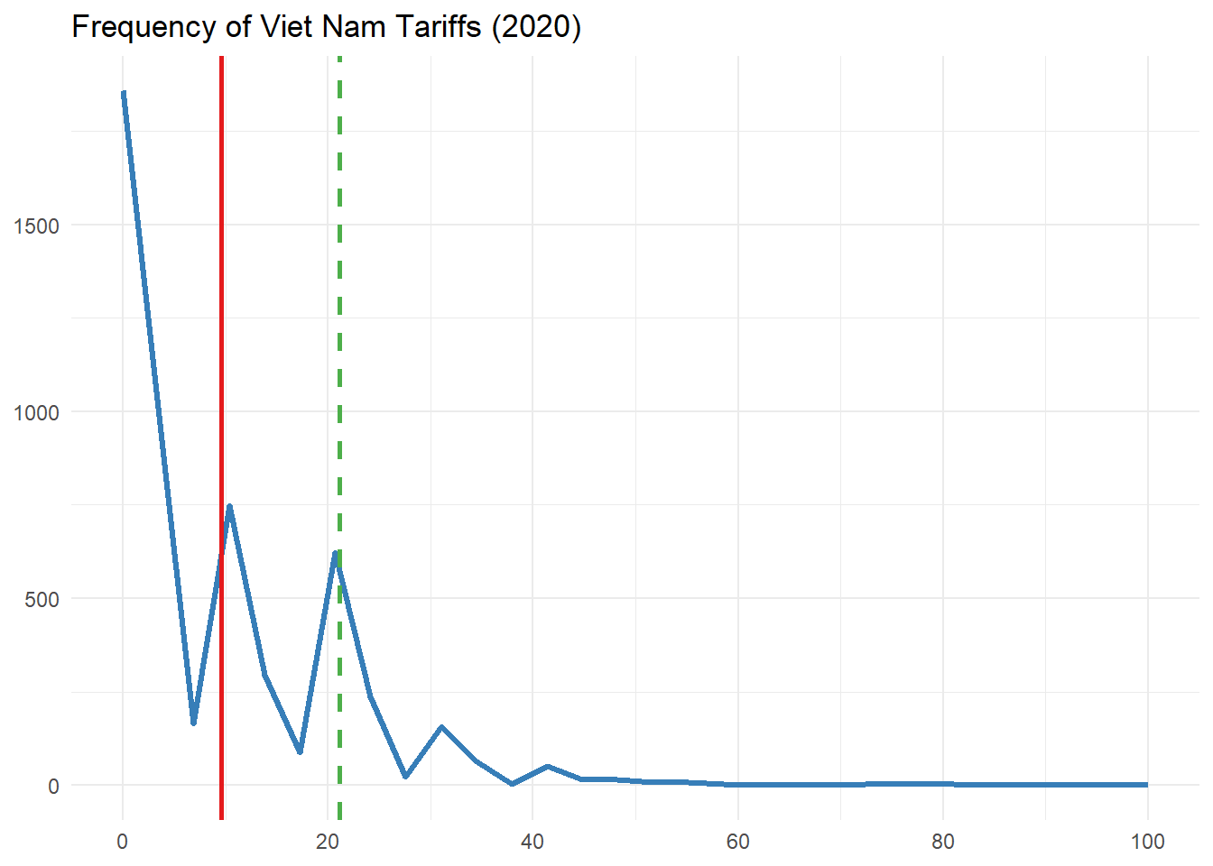
The above graph represents the frequency of MFN tariffs applied by Viet Nam. The horizontal axis is the tariff value (in per cent), the vertical axis is the frequency with which that value appears in the schedule (in this case we have roughly 5000 tariff lines). A lot of products defined at 6-digit of the HS have zero tariffs applied, but a few reach up 100 per cent and more. The red line marks the simple average – around 10 per cent. The green line marks one standard deviation (calculated at 11.53 per cent) from the average. The wider the range of tariff values, the greater the distance between the red and green lines will be.