Chapter 4 Graphs
4.1 Plot basics
For this session, please download this. This is the link to the original data.
Let’s upload the data set. Since it is a CSV file, we use the read.csv command. We add the argument stringsAsFactors = FALSE because we do not want to read the string values as factors. (Remember you can use ?read.csv to see all possible arguments.)
df <- read.csv("data/sample_data.csv",
              stringsAsFactors = FALSE) #add this so that characters are not read as factors
Let’s see the column names and the class of each.
names(df)## [1] "iso3" "year" "country" "gdp_per_capita"
## [5] "pop" "fertility"class(df$country)## [1] "character"head(df)## iso3 year country gdp_per_capita pop fertility
## 1 ARG 1968 Argentina 6434.954 23261278 3.049
## 2 ARG 1969 Argentina 6954.764 23605987 3.056
## 3 ARG 1970 Argentina 7056.848 23973058 3.073
## 4 ARG 1971 Argentina 7335.759 24366439 3.104
## 5 ARG 1972 Argentina 7329.921 24782949 3.148
## 6 ARG 1973 Argentina 7407.367 25213388 3.203We can see that this data set contains GDP/capita (gdp_per_capita), population (pop) and fertility rate (fertility) for each country per year.
Let’s begin with the relationship between GDP/capita versus population by plotting a scatter plot. Remember for the plot(x,y), we first include the x-axis.
plot(df$pop,df$gdp_per_capita)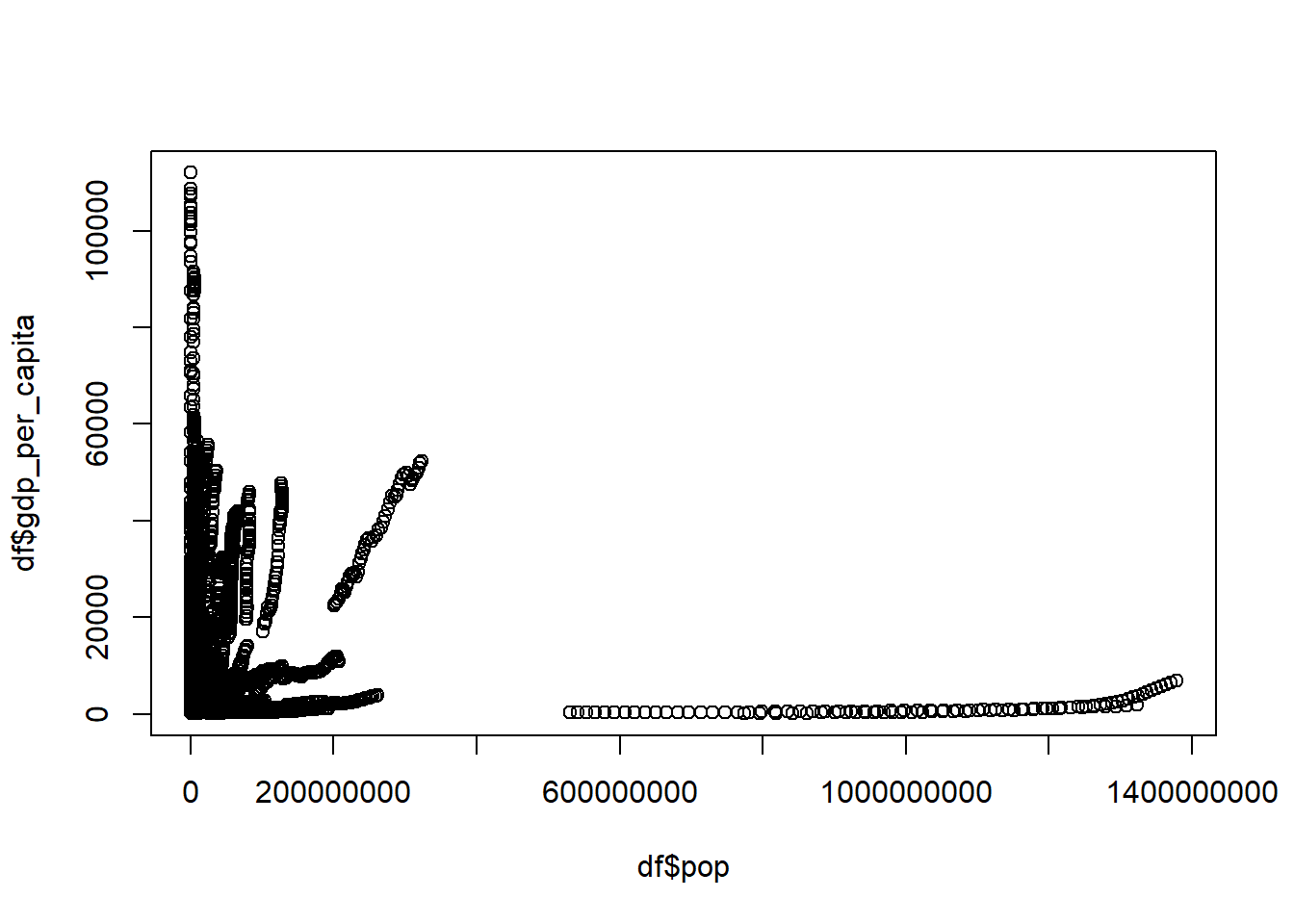
Quiz
How do we get the latest year in the data and how do we plot the relationship between the GDP/capita and population for only the latest year?
Your graph should look like this:
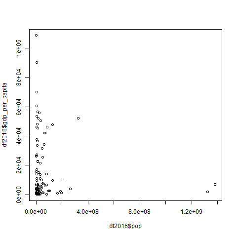
#We can find the latest year by running the code:
max(df$year)

#This gives 2016. To get the plot for 2016 for population and GDP/capita we first subset the data for the year 2016:
df2016 <- df[df$year==2016,]

#Then we run the following code:
plot(df2016$pop,df2016$gdp_per_capita)
4.2 Plots continued
When the scales are different, we take the logarithm. In this case we use base 10 for graphs as it is easier to interpret them:
df2016 <- df[df$year==2016,]
plot(log(df2016$pop, base=10),df2016$gdp_per_capita)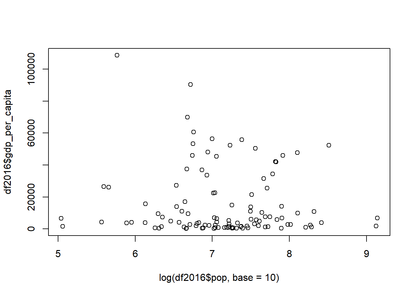
A better package to use in R for making graphs is ggplot2:
#install.packages("ggplot2")
library("ggplot2")
## Warning: package 'ggplot2' was built under R version 3.5.3The first line, which is commented out (#install.packages("ggplot2")), is the code to install ggplot2. Uncomment the line by deleting the # and install ggplot2 if you don’t have it by running install.packages("ggplot2"). In general, R has quite a few packages already installed, but some are not there.
The second line - library("ggplot2") makes sure that the package is in use. Do not forget to run such a code for any R package that you have installed yourself for any new session. Otherwise you will get such an error:
Error in ggplot(XXX) : could not find function “ggplot”
Let’s now try to create a plot with ggplot.
We first specify in ggplot the data set to be used, this case df. The next option aes is for specifying the variables and any other options related to them. geom_point is used for a scatter plot. Here is an example of a ggplot with the population and GDP/capita:
ggplot(df,aes(pop,gdp_per_capita)) + # says which data set and variables to use
  geom_point() #what to do with that data and variables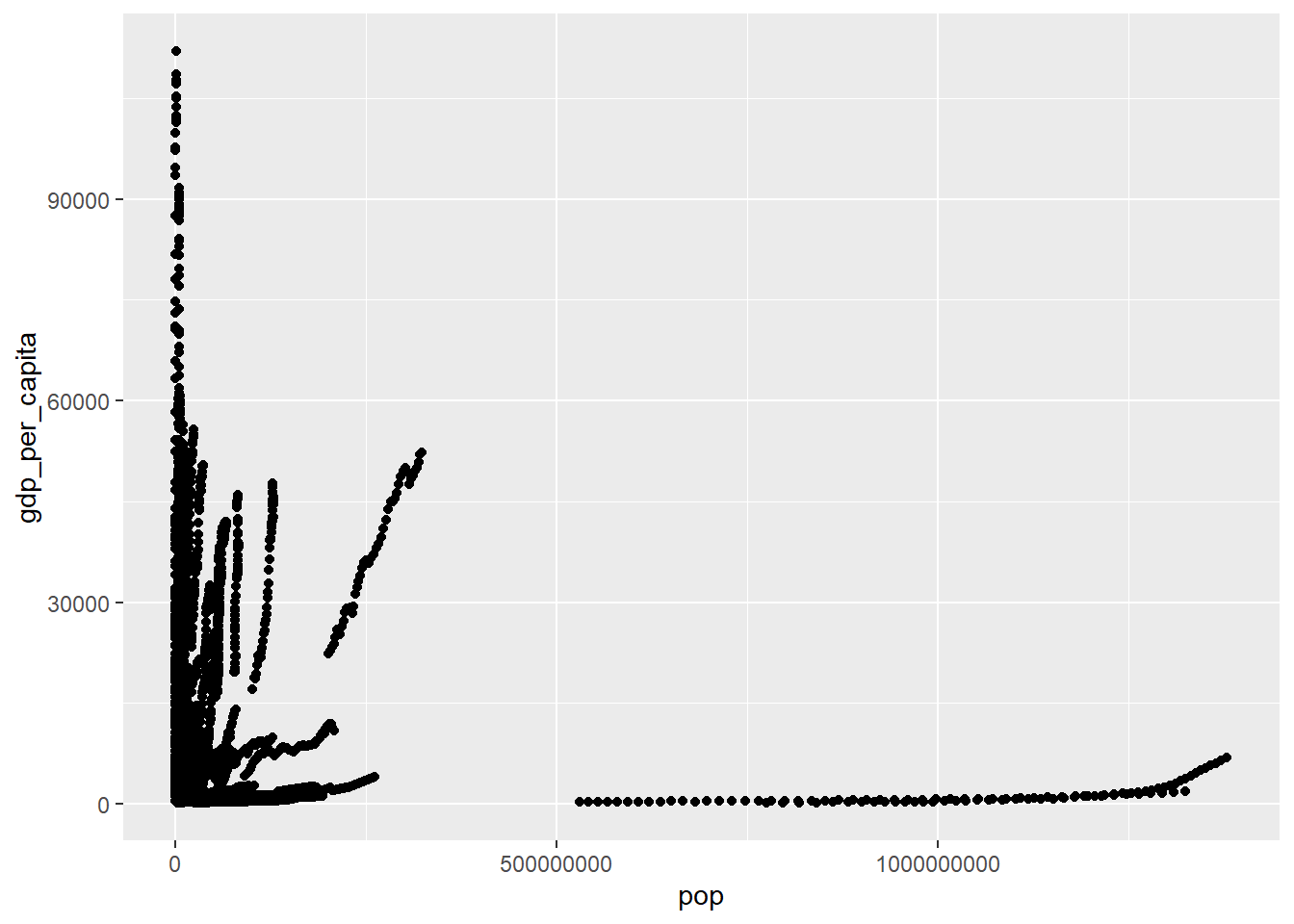
The same but for 2016 only:
ggplot(df[df$year==2016,],aes(pop,gdp_per_capita)) +
  geom_point()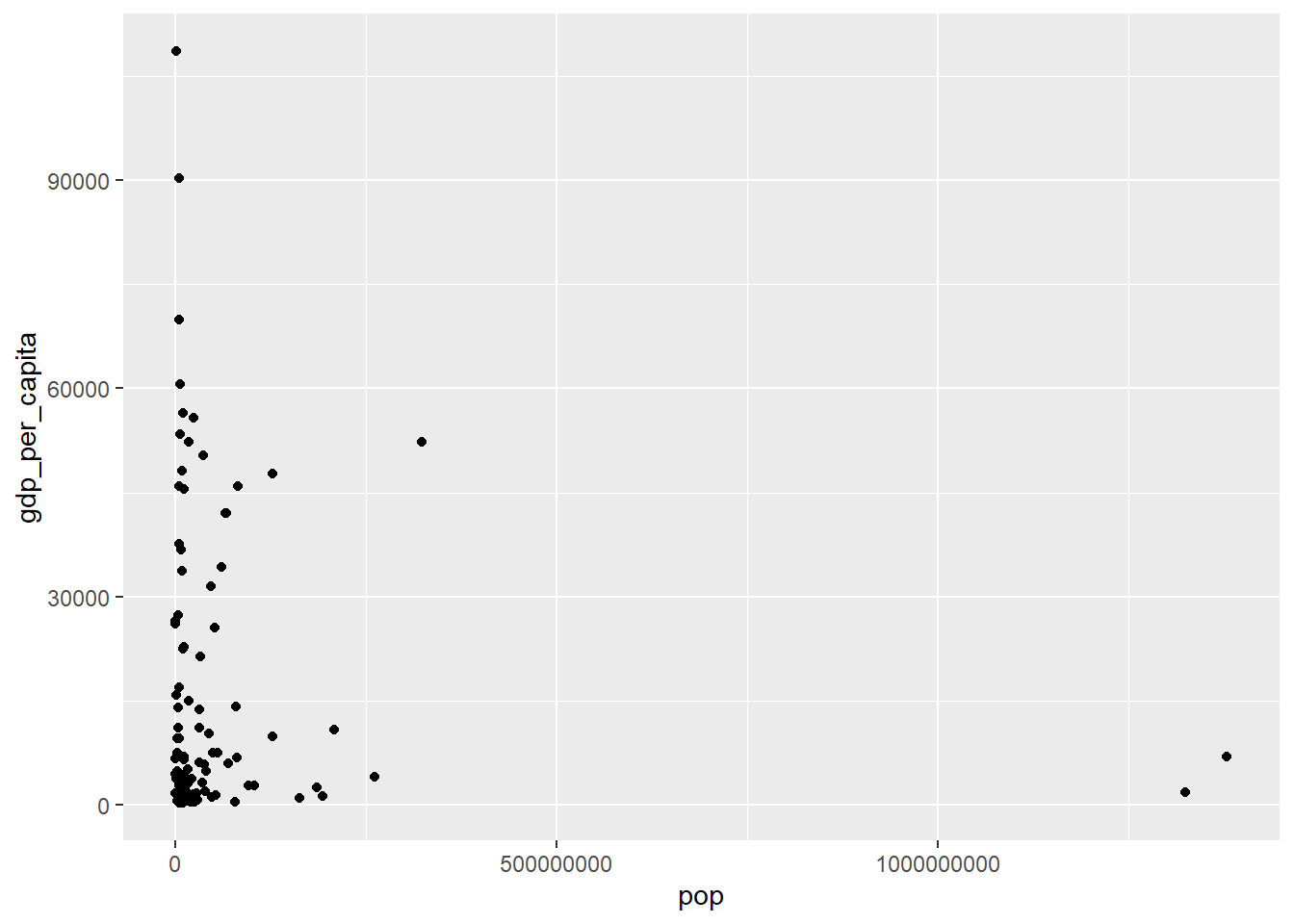
Notice what the difference is with the previous code. (Answer: df[df$year==2016,])
We can also plot GDP/capita against fertility rate in 2016:
ggplot(df[df$year==2016,],aes(gdp_per_capita,fertility)) +
geom_point() 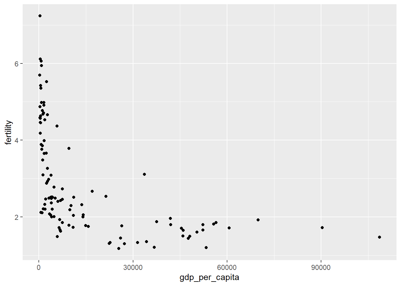
We can add a fitted line with the command geom_smooth and specify the method for the fitted line. In this case we add a linear model lm with the formula “y = x + c” or y~x:
ggplot(df[df$year==2016,],aes(gdp_per_capita,fertility)) +
  geom_point() +
geom_smooth(method='lm',formula=y~x) 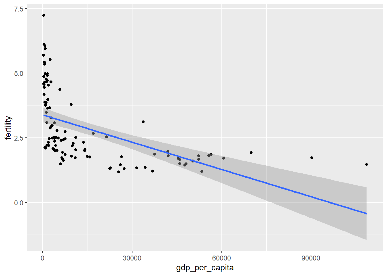
We plot the logarithm of the GDP/capita against fertility rate in 2016 to control for skewness:
ggplot(df[df$year==2016,],aes(log(gdp_per_capita),fertility)) +
  geom_point()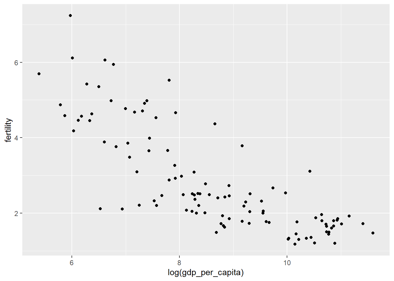
(A reminder: we use logarithm for the GDP/capita variable to make the difference between larger points less, e.g. respond to skewness towards large values. At other times, logs are used if we want to show percent change.)
The problem is the x-axis units are now not easily interpreted. We can fix this by scaling the x-axis to log 10:
ggplot(df[df$year==2016,],aes(gdp_per_capita,fertility)) +
  geom_point() +
  scale_x_log10()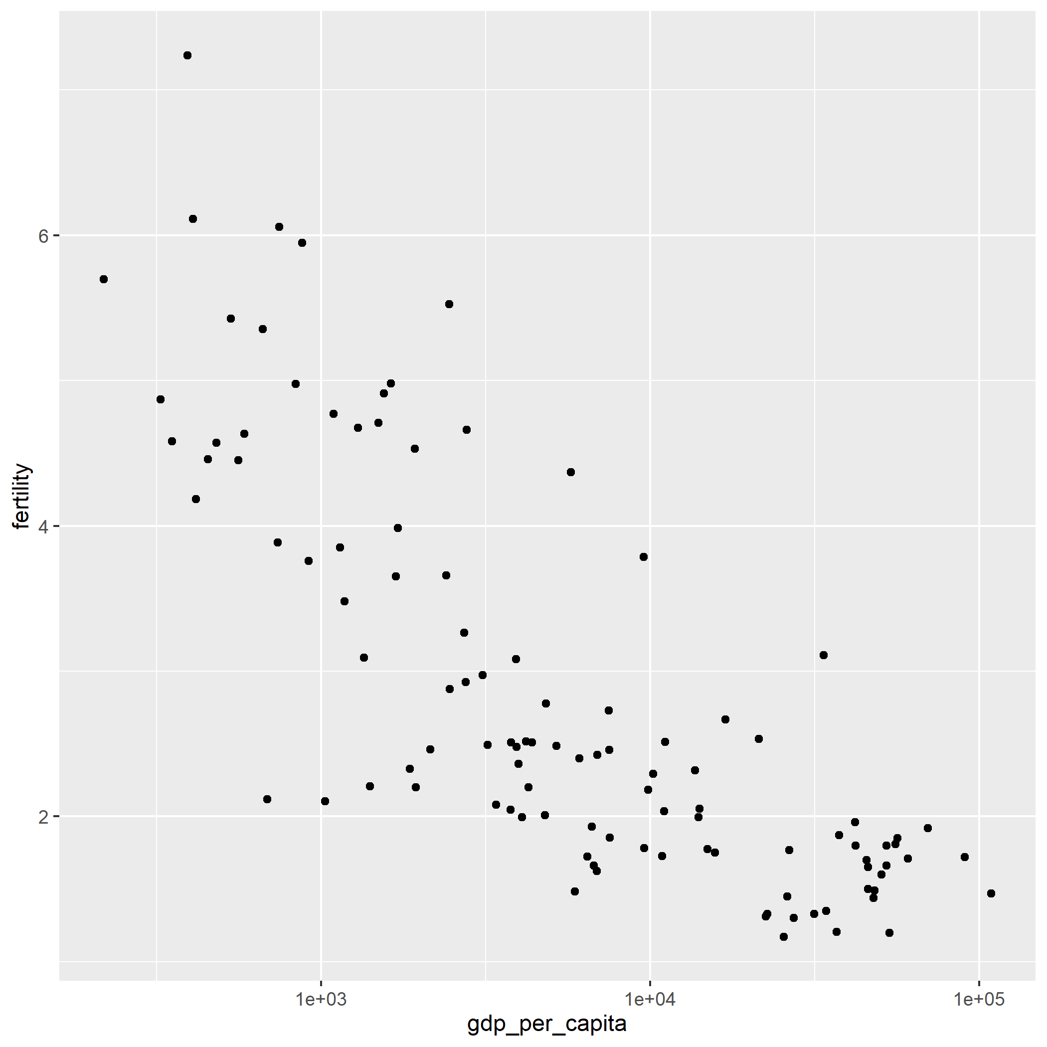
We can omit the scientific notation using options(scipen = 999):
options(scipen = 999)

ggplot(df[df$year==2016,],aes(gdp_per_capita,fertility)) +
  geom_point() +
  scale_x_log10()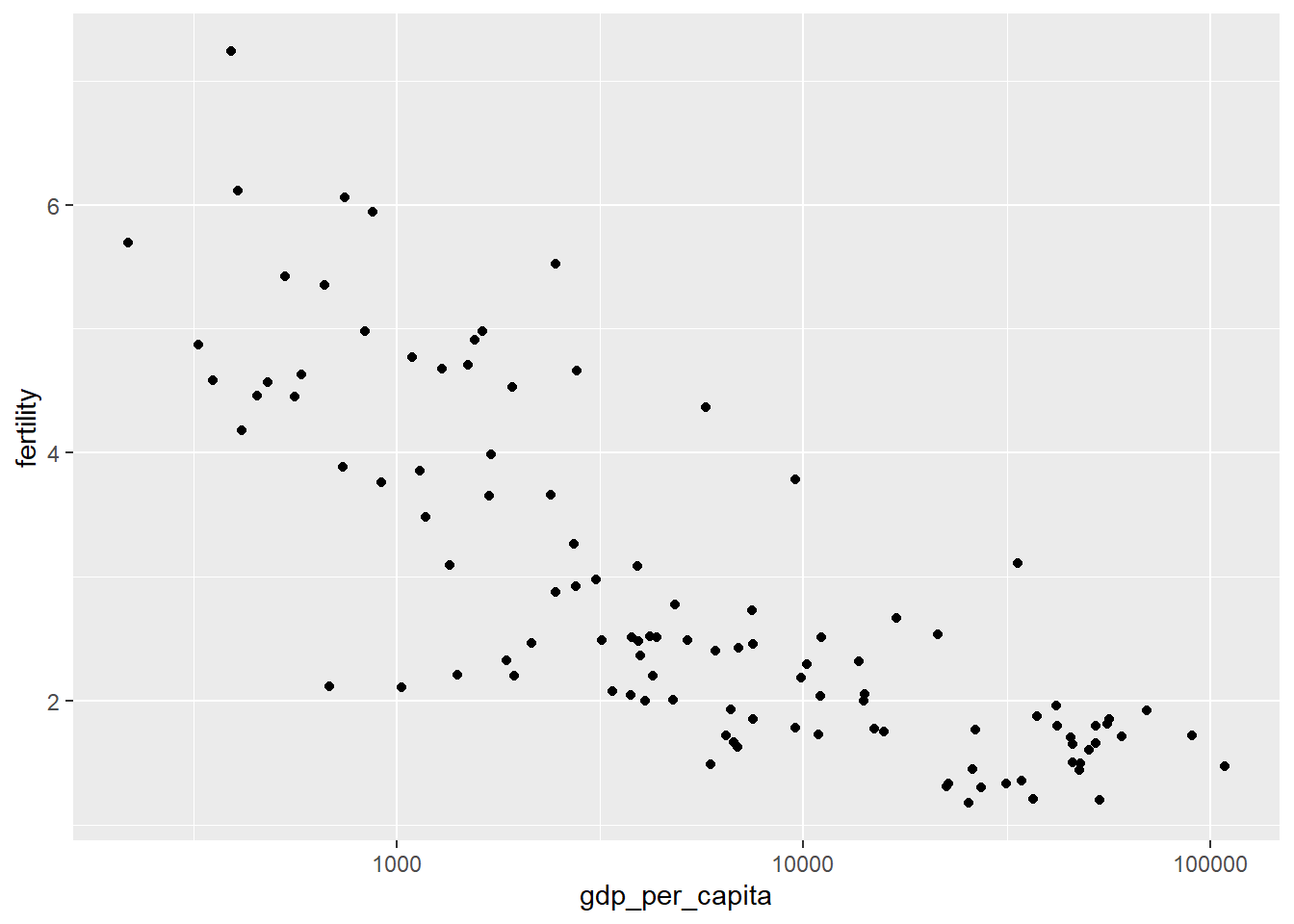
(If you have already used options(scipen = 999) in your current session, you will not see any changes because you have already told R to omit the scientific notations.)
We can scale the points proportional to the population size with the specification size=pop:
ggplot(df[df$year==2016,],
       aes(gdp_per_capita,fertility,size=pop)) +
  geom_point() +
  scale_x_log10()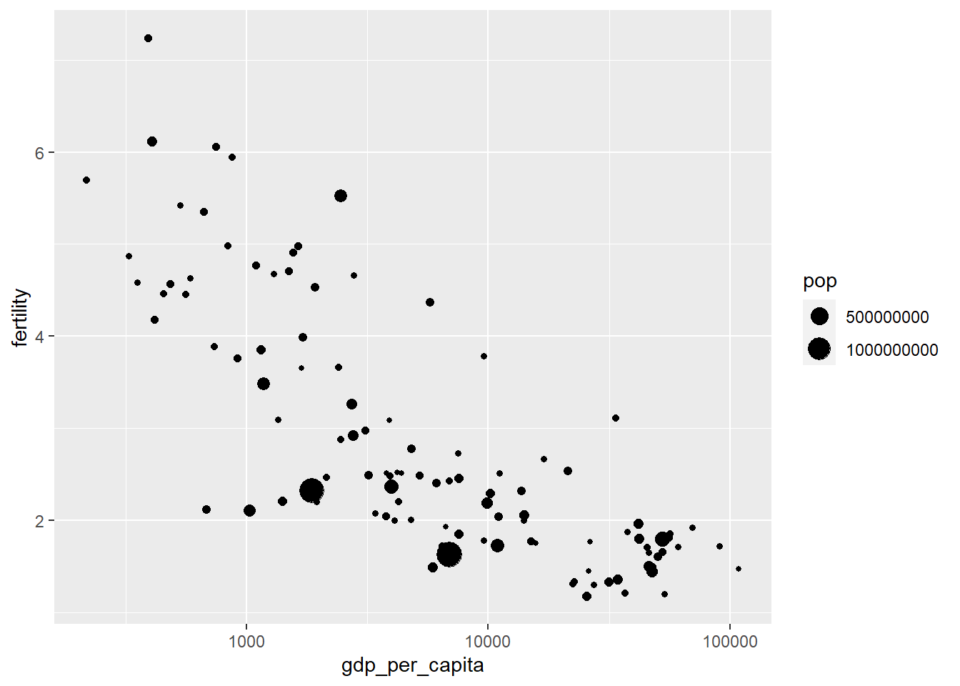
Make the color different for countries with color=iso3:
ggplot(df[df$year==2016,],
       aes(gdp_per_capita,fertility,size=pop,colour=iso3)) +
  geom_point() +
  scale_x_log10()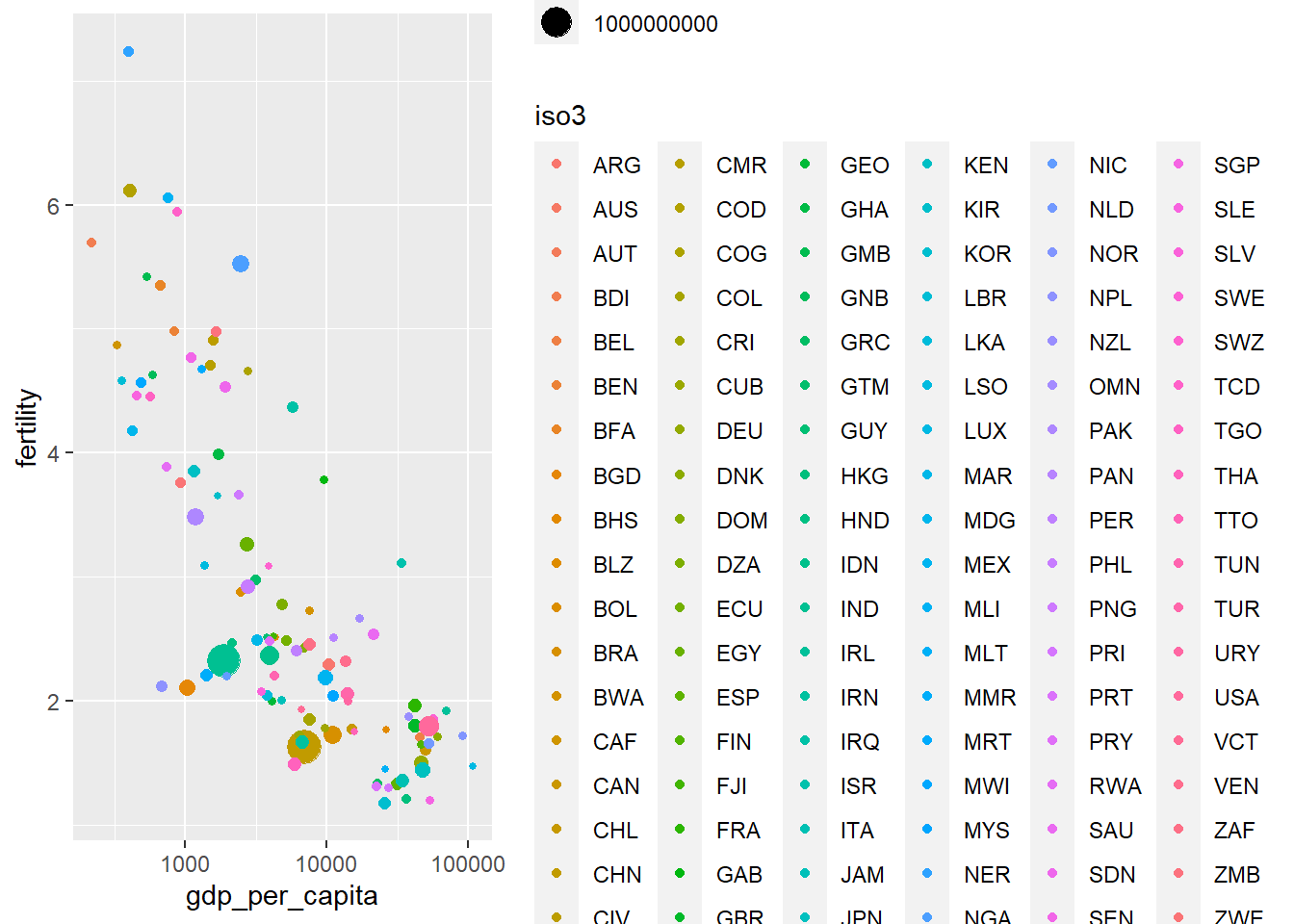
Quiz
A good exercise to do by yourself would be to match the ISO3 codes with the regions (eg. Europe, Africa, etc.) and make the color per region, rather than country. (Hint: use the data set codes from Section 3 and the function merge.)
Your plot should look like this:
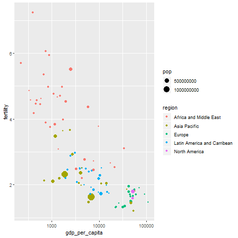
#In the "codes" data set we can find the code of a country alongside its region. So let's add the region column to our `df` data set like this:
df_merged <- merge(df, codes)

#Then we just run the ggplot code:
ggplot(df_merged[df_merged$year==2016,],
       aes(gdp_per_capita,fertility,size=pop,colour=region)) +
  geom_point() +
  scale_x_log10()
4.3 Further specifications for graphs: adding axes titles and animation
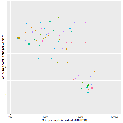
Let’s continue! We can exclude the legend and add axes titles by specifying labs:
ggplot(df[df$year==2016,],
       aes(gdp_per_capita,fertility,size=pop,colour=iso3)) +
  geom_point(show.legend = FALSE) + #exclude the legend
  scale_x_log10() +
  labs(x="GDP per capita (constant 2010 USD)",       #add x axis title
       y="Fertility rate, total (births per woman)") #add y axis title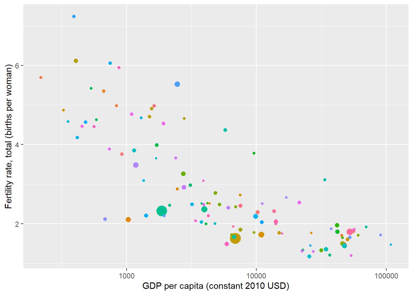
We add the time dimension by specifying the entire data set ‘df’ (and not just for the year 2016):
ggplot(df,
       aes(gdp_per_capita,fertility,size=pop,colour=iso3)) +
  geom_point(show.legend = FALSE) +
  scale_x_log10() +
  labs(x="GDP per capita (constant 2010 USD)",
       y="Fertility rate, total (births per woman)")
What is more, with ggplot we can also make graph animations. We need to install two additional packages as mentioned below. (Make sure to uncomment these lines.)
#install.packages('gifski')
library("gifski")
#install.packages('tweenr')
library("tweenr")
## Warning: package 'tweenr' was built under R version 3.5.3# install.packages("devtools")
# devtools::install_github('thomasp85/transformr')
# devtools::install_github('thomasp85/gganimate')
library("gganimate")## Warning: package 'gganimate' was built under R version 3.5.3#install.packages('png')
library("png")Making an animated graph and saving it as a GIF:
animated_ggplot <- ggplot(df,
       aes(gdp_per_capita,fertility,size=pop,colour=iso3)) + # adding size=pop
  geom_point(show.legend = FALSE) +
  scale_x_log10() +
  labs(x="GDP per capita (constant 2010 USD)",
       y="Fertility rate, total (births per woman)") +
  transition_time(year)
animated_ggplot
anim_save("animated_ggplot.gif")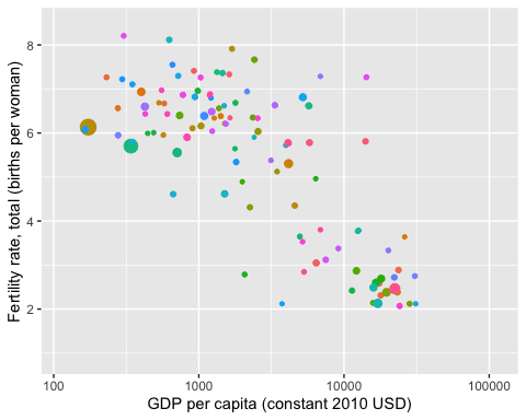
If you make this on your R Studio, don’t forget to click on the “Viewer” tab on the right side to see it!
The command transition_time(year) makes an animation that shows the different states of the data during the different years.
We can add a title (Year) to the graph by specifying in labs - title="Year: {frame_time}":
animated_ggplot2 <- ggplot(df,
       aes(gdp_per_capita,fertility,size=pop,colour=iso3)) + # adding size=pop
  geom_point(show.legend = FALSE) +
  scale_x_log10() +
  labs(x="GDP per capita (constant 2010 USD)",
       y="Fertility rate, total (births per woman)",
       title="Year: {frame_time}") +
  transition_time(year)

anim_save("animated_ggplot2.gif", animated_ggplot2)
We can set up the height and width options:
options(gganimate.dev_args = list(width = 780, height = 440))You can take an gganimate image and render it into an animation with the command animate. We can see all the options of animate like this:
?animate Or you can also google the question adding “stackoverflow”.
This is an example where we slow down animated_ggplot2:
animate(animated_ggplot2, nframes=350, fps=20) # to make it go slower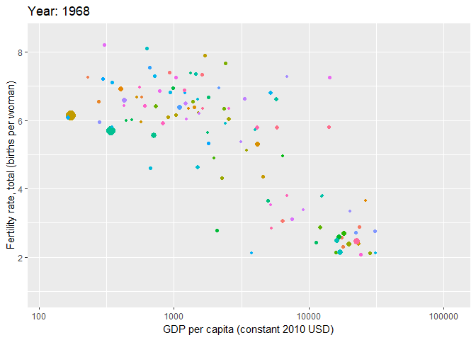
#increase number of total frames or decrease frames per secondQuiz
Let’s do one last practice!
Make a gganimate graph but with region as the color. (Hint: Check what we did for Quiz 4.2!)
Your gganimate plot should look like this:
# we merge our trade data with the codes data
df_merged <- merge(df, codes)

# construct the animated ggplot but we specify region as our color
animated_ggplot3 <- ggplot(df_merged,
       aes(gdp_per_capita,fertility,size=pop,colour=region)) +
  geom_point(show.legend = FALSE) +
  scale_x_log10() +
  labs(x="GDP per capita (constant 2010 USD)",
       y="Fertility rate, total (births per woman)",
       title="Year: {frame_time}") +
  transition_time(year)

# put the same specifications for the animation as before
animate(animated_ggplot3, nframes=350, fps=20)